Mix patterns without clashing: 4 scale-and-colour moves that actually work
 Save
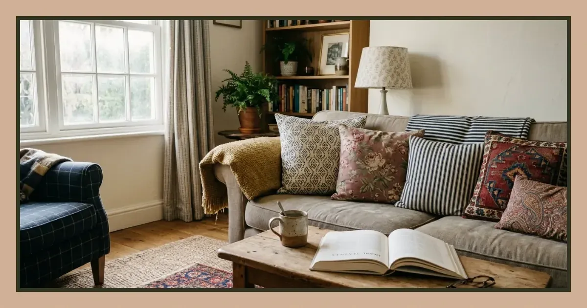
Mixing patterns in a room feels risky because most advice skips the method and goes straight to "trust your eye". Fleur and Grey walks through a clearer approach: match your prints by scale first, then tie them together through shared colour temperature or repeating hues. You'll know whether two fabrics belong in the same room before you buy them, and the result will look intentional rather than accidental.
Start with one large-scale pattern as your anchor
Pick the boldest print first. A large floral on curtains, an oversized geometric on a rug, or a wide stripe on a sofa gives the room a clear visual lead. Everything else you add will answer to this piece, so choose it for the space it will occupy and the feeling you want.
Large patterns carry weight. They dominate a room even when the colour is soft, so place them where you want the eye to land first—usually the largest fabric surface or the architectural feature that frames the room.
Add a medium-scale print that shares at least one colour
The second pattern should sit between half and a quarter of the scale of your anchor. If the first print has blooms the width of your hand, the second might have a grid or a paisley motif the size of a biscuit. The size difference stops them competing; the shared colour is what makes them feel related.
Pull one hue from the large print and find it again in the medium one. The match doesn't need to be exact—two blues in different saturations will work—but the colour family should be recognisable. This overlap is what holds the combination together when everything else differs.
Work within the same colour temperature
Warm and cool palettes rarely mix well in pattern. If your anchor leans warm—terracotta, mustard, rust—keep your second print in that range. A cool palette built on slate, teal or navy should stay there. Mixing temperatures can work if one pattern is nearly neutral, but it's harder to get right and easier to avoid.
Introduce a small-scale pattern or a solid with texture
The third layer can be another print, much smaller than the first two, or a textured solid that gives the eye somewhere to rest. Small florals, mini checks, ticking stripes and dot prints all work here. So do linens, chunky knits and slubby weaves that read as solids from a distance but carry detail up close.
This is where you can repeat a colour from your anchor without adding visual noise. A plain cushion in the same green as a leaf in your curtain fabric stitches the room together without requiring another pattern decision.
Distribute the patterns across different surfaces
Spread your choices across fabric types and locations. Curtains, cushions, upholstery, rugs and throws each serve a different function and sit at different heights, so they don't crowd one another even when the prints are bold. Stacking all your patterns on the sofa in a line of cushions flattens the effect; placing one on the armchair opposite and another on the window gives the room depth.
Avoid putting two large-scale patterns next to each other unless they share most of their palette and one is significantly quieter. Side-by-side prints of the same visual weight will always look like a mistake, no matter how well the colours match.
Use this method to test combinations before committing
- Lay your samples or swatches on a table in daylight and check the scale difference between each pair.
- Identify the colours that appear in more than one print and confirm they sit in the same temperature range.
- Stand back and squint—the patches of colour should blur into a balanced distribution, not a fight for attention.
- Hold the samples up in the room where they'll actually sit, because artificial light and surrounding walls will shift how they read.
When to break the scale rule
Two patterns of similar scale can coexist if one is much lighter in tone or quieter in contrast. A pale stripe and a barely-there floral, both mid-scale, might sit comfortably together because neither shouts. The risk is still higher than sticking to the scale ladder, but the pairing can work if colour and contrast are doing the balancing instead.
Common mistakes that make patterns clash
The first is adding too many. Three prints plus a textured solid is plenty for most rooms; a fourth often tips into chaos unless the space is large and the patterns are carefully distributed. The second mistake is ignoring undertone—two greens that look close in the shop will clash at home if one leans yellow and the other leans blue.
Matching every colour across every pattern is the third error. Rooms that repeat the exact same palette in every fabric feel coordinated in a stiff, show-home way. Let some prints introduce a colour the others don't carry, as long as the overall temperature stays consistent.
How pattern mixing differs depending on the room
| Room | What works | What to limit |
|---|---|---|
| Living room | Bold anchor on large surfaces; multiple smaller prints across cushions and throws | Competing large-scale prints on opposite walls |
| Bedroom | Quieter combinations; one statement print on bedding or curtains with tonal supports | High-contrast patterns near the bed |
| Kitchen | Small-scale prints on tea towels, seat pads or blind; easy to swap out | Permanent pattern on large expanses like splashbacks |
Hallways and small spaces benefit from fewer, bolder choices. One striking wallpaper or a single patterned runner often does more than several cautious prints trying to coexist in a narrow corridor.
Build confidence by starting small
If the whole method feels overwhelming, begin with cushions or a throw. These are low-commitment, easy to remove, and cheap enough to replace if the combination doesn't work. Once you've proved the principle on a small scale, the same approach applies to curtains, upholstery and rugs.
You don't need to get it right first time. Pattern mixing improves with repetition, and most people find their eye becomes more reliable once they've tested a few combinations in their own light and against their own walls. Understanding the 60-30-10 rule can also help you think about how much space each print should occupy relative to the others.
Download PDF: Pattern Mixing Checklist for Your Room PDF, 29 KB
Further reading
Frequently asked questions
Can you mix floral and geometric patterns in the same room?
Yes, as long as they differ in scale and share at least one colour. A large geometric and a smaller floral will work better than two florals of similar size, because the difference in motif style adds variety without causing competition.
How many patterns is too many for a living room?
Three prints plus a textured solid is a practical ceiling for most living rooms. More than that requires a large space and careful distribution across different surfaces to avoid visual clutter.
What if my patterns share a colour but still look wrong together?
Check the undertone and the scale. Two patterns in the same colour family can clash if one leans warm and the other cool, or if they're too close in scale and compete for attention. Adjusting either variable usually solves the problem.