Make sense of the 60-30-10 rule in 3 clear examples
 Save
The 60-30-10 rule divides a room's colour into three parts: sixty per cent for the dominant shade, thirty per cent for a secondary colour and ten per cent for an accent. It gives you a starting ratio that keeps a space balanced without feeling flat. Fleur and Grey breaks down how it works in practice, where it helps most and when you can safely ignore it.
Start with the three parts and what fills them
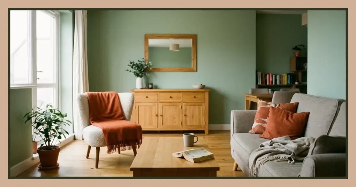
The dominant sixty per cent covers your walls, large furniture or floors—whichever surface takes up the most visual space. The secondary thirty per cent sits on upholstery, curtains, rugs or a feature wall. The ten per cent accent goes on cushions, lampshades, artwork or throws.
In a living room with magnolia walls, a grey sofa and ochre cushions, the walls are your sixty, the sofa is your thirty and the cushions are your ten. The proportion keeps one colour from drowning out the others.
See how it plays out in three different rooms
A bedroom with painted walls. Pale blue walls fill the dominant slot. A linen bedspread in natural beige takes the secondary share. Terracotta cushions and a small ceramic vase handle the accent.
An open-plan kitchen-diner. White cabinetry and walls sit at sixty per cent. Navy dining chairs and a patterned runner cover thirty. Brass handles, a copper pendant and a rust-coloured tea towel make up the final ten.
A small bathroom. White tiles occupy the main proportion. Charcoal grouting and a dark vanity unit take the middle third. A sage-green hand towel and a single potted plant finish the accent layer.
Apply the rule when you're starting from scratch
The ratio works best when you have a blank slate and no inherited furniture. Pick your dominant colour first—the one you can live with on the largest surface. Then choose a secondary that complements or contrasts without competing. The accent can be bolder because it covers less ground.
If you're redecorating a rental with white walls already in place, those walls become your sixty by default. You only need to settle the other two.
Compare where the rule helps and where it doesn't
| Situation | Does the rule help? | Why |
|---|---|---|
| Empty room, fresh paint | Yes | Gives a clear starting structure |
| Inherited furniture you're keeping | Partly | You work backwards from what you have |
| Pattern-heavy room | No | Patterns add complexity the ratio can't account for |
| Monochrome scheme | No | Tonal variation matters more than proportion |
When pattern takes over
A printed wallpaper or a patterned rug introduces multiple colours at once. The sixty-thirty-ten split becomes hard to track because no single shade dominates. In these rooms, balance comes from spacing busy areas with calm ones rather than counting percentages.
Bend the rule to suit how you actually use the room
If you want a cosier feel, push the secondary colour up to forty per cent and drop the dominant to fifty. The room feels less stark. If you prefer high contrast, take the accent to fifteen or twenty per cent—it makes a stronger statement without tipping into chaos.
Rooms with limited natural light benefit from a lighter dominant colour even if you prefer darker tones. You can still honour the ratio by keeping your preferred dark shade in the secondary slot.
Adjust for furniture you already own
A large sofa in a colour you're not repainting around becomes your thirty per cent whether it fits the rule or not. Work with it: choose a dominant wall colour that sits back and let the sofa anchor the middle layer. Your accent can then tie the two together or add contrast.
Follow these steps to build your own scheme
- Identify which surface in the room covers the most area—walls, floor or a large piece of furniture.
- Pick a colour for that surface and commit it to the sixty per cent slot.
- Choose a second colour that either complements or contrasts and assign it to thirty per cent of the room's remaining surfaces.
- Select a third, bolder colour for the smallest elements—cushions, artwork, accessories—and keep it to roughly ten per cent.
- Step back after a week and adjust the accent if it feels too loud or the secondary if it competes with the dominant.
Know when to ignore the ratio entirely
Monochrome schemes rely on shades of one colour, so the sixty-thirty-ten split becomes irrelevant. Minimalist interiors often use two neutrals and texture instead of colour. Maximalist rooms layer pattern and tone without worrying about proportion at all.
If a room already feels balanced to you, measuring it against a formula won't improve it. The rule is a scaffold, not a requirement.
Check your proportions with a quick visual test
Stand in the doorway and squint. The colour you see most should be your dominant. The second-most visible becomes your secondary. The accent should catch your eye without overwhelming the other two.
If the accent feels as prominent as the dominant, you've likely used too much of it. Swap one or two accent pieces for something in the secondary colour. If the room feels flat, add more of the accent until a focal point emerges.
Use samples before committing
Paint a large scrap of card in your proposed dominant colour and prop it against the wall for a few days. Drape fabric in your secondary colour over a chair. Place a cushion or object in the accent colour on a shelf. Live with the combination before buying tins or reupholstering anything.
Further reading
Frequently asked questions
What is the 60-30-10 rule in interior design?
The 60-30-10 rule splits a room's colour into three proportions: sixty per cent for the dominant colour, thirty per cent for a secondary and ten per cent for an accent. It creates balance by giving one colour the lead without letting the others disappear.
How do you apply the 60-30-10 colour rule in a living room?
Assign the dominant sixty per cent to walls or large furniture, the secondary thirty per cent to upholstery or curtains, and the accent ten per cent to cushions, artwork or small accessories. Adjust the ratio if inherited furniture shifts the balance.